Art Director
Siilinjärvi
Visual identity for the municipality of Siilinjärvi.
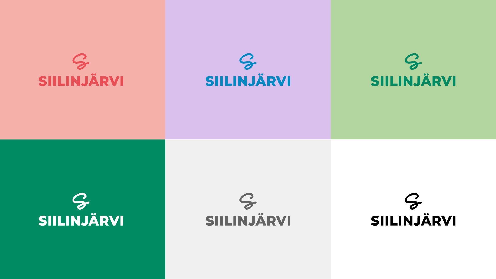
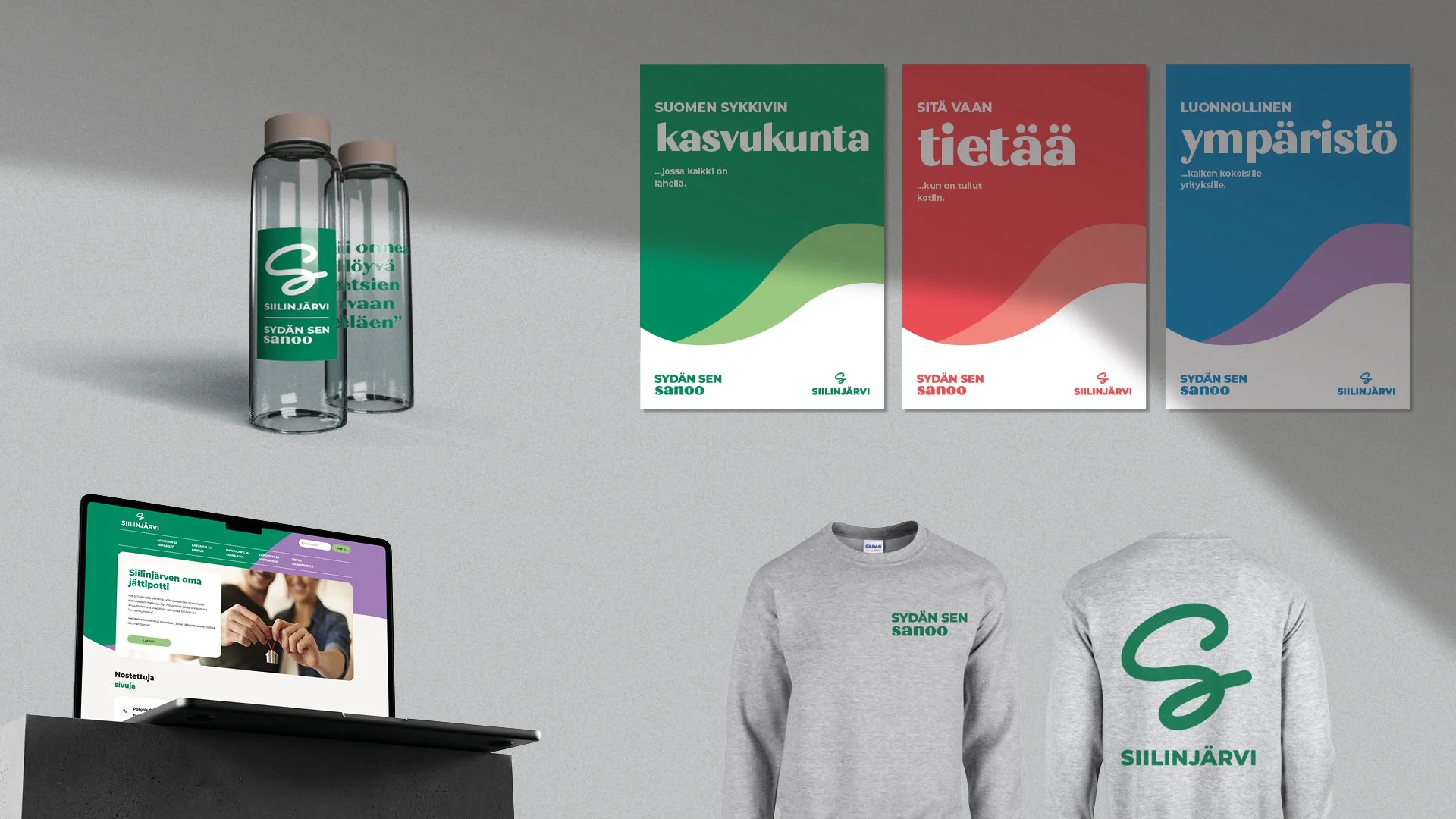
We created a new visual identity for the municipality of Siilinjärvi. The aim was to create something colorful & approachable – with a twinkle in the eye – just like savonian people.
The stylized s-symbol represents the location of Siilinjärvi in the crossroads of several big highways.
The letter s is also a playful emblem for Siilinjärvi: as the slogan is also “sydän sen sanoo”.